AN EARLY REMINDER to make plans for our MISCmedia@1 party on Thursday, June 8, starting around 7:30 p.m., at the quaint Ditto Tavern, 5th and Bell. Yeah, it’s 21 and over.
SOME SHORT STUFF this Memorial day, starting with two words you should start remembering:
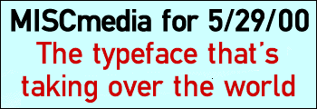
“Fette Mittlelschrift.”
You’ve probably never heard its name before, but you’ve seen it.
It’s the typeface that’s taking over the world.
(Some type suppliers call it “Meta,” but we’ll choose to call it by the more-fun name.)
Last year, it seemed every wannabe-hip graphic designer and design client (from rave flyers to MTV to Urban Outfitters) was agog over plain old Helvetica, the typeface they all saw as representing the sleek modernism people in the ’60s thought people in the ’00s would all be living in. (I, as a former late-’70s-early-’80s young adult, still identify Helvetica with bad early desktop publishing and Penthouse magazine.)
But now that nostalgia for formerly-predicted 21st centuries is a fairly done deal, this newer sleek-modern sans serif face is spreading everywhere.
Readers around here probably know Fette Mittelschrift as the typeface in The Bon Marche’s current ads. It’s immediately identifiable by its narrow letter shapes, its large “x” sizes, and the peculiar lower-right curve in its lower-case “L”s.
Once you recognize it, you’ll start spotting it everywhere–Harper’s Bazaar cover blurbs, assorted smaller lifestyle and fashion rags, on-screen graphics on The NBA On TNT and the Independent Film Channel, and ads and in-store signs for Bank of America, Canon, Merrill Lynch, Payless ShoeSource, Kmart, Oldsmobile, Subaru, American Express, HBO, Philip Morris (those pathetic “Working to Make A Difference” spots), and many, many others.
(Similar, but not precisely identical, typefaces are used by the new P-I TV listings and those annoying ABC “We Love TV” ads.)
But be careful–once you start realizing just how widespread Fette Mittelschrift is, you could end up seeing it everywhere; or even obsessively-compulsively repeating the name, a la Zippy the Pinhead. “Fette Mittelschrift, Fette Mittelschrift, Fette Mittelschrift.”
PHILM PHUN: Let’s attempt, for future readers, to explain some prospective future confusion.
The 2000 release American Psycho was, on at least one level, about beauty–a cold, antihuman, perfectionistic ideal of beauty.
The 1999 release American Beauty was about psychos–four adults and three teenagers, each a case study in a different type of psychological dysfunction (neurosis, paranoia, catatonia, voyeurism, transferred incest-compulsion, etc.).
Critics who called AB just another anti-suburban slam were wrong. It’s really a taut character study that could be set in any affluent North American setting. It’s just that the “wide open spaces” setting clashes perfectly with the characters’ internal confinement.
TOMORROW: The city Paul Allen’s building, in spite of us.
ELSEWHERE: