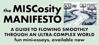
It's here! It's here! All the local news headlines you need to know about, delivered straight to your e-mail box and from there to your little grey brain.
Learn more about it here.
Sign up at the handy link below.
CLICK HERE to get on board with your very own MISCmedia MAIL subscription!
via dailymail.co.uk
via kathrynrathke.blogspot.com
All good tidings and shout-outs to my fellow Stranger refugee and prominent commercial illustrator Kathryn Rathke. She’s created the new official logo for Wendy’s restaurants. The deceptively simple mascot caricature took three years of client approval and market testing.
It’s 10/11/12! The sort of date-progression that only happens 11 times in a century and is utterly, completely meaningless!
Elsewhere in randomness:
kurzweilai.net
via imdb
It’s 10/4, good buddy!
via fastcompany.com
We continue now to reminisce about the last Puyallup Fair (or the first “Washington State Fair,” since the new name was phased in during this year’s advertising). Of course, if you’re reading this in standard blog order, you’re seeing this second part first. Ah, the Web’s particular slant on the time-space continuum…
Some performers, such as these young fiddlers, were there for the purpose of preserving cultural traditions.
Some tried to turn old traditions into new audience-pleasers.
And some were just for fun.
Of course, all the familiar food stuffs could be had. Some of the same concessionaires have been at the fair for decades; some have no other business activities but this.
Kitchen-gadget demonstrations were everywhere and nonstop; as were booths selling stuff (below).
As were people selling ideas, including the idea of a better future.
As mentioned in our prior installment, fair officials are trying to strengthen its roots as a celebration of agriculture. Part of the plan includes year-round community and demonstration gardens, that would display produce in its “living” form.
The new plan would also replace many of the venerable livestock barns.
Veterinary regulations meant sheep and cattle could not be on the premises the same day. Instead, there was a milking demonstration with a plastic cow. (This, I believe, is where non-dairy creamer comes from.)
No such restriction was needed for the horses, or the young horsemen and horsewomen competing in the equestrian finals. The sign on the fence: NO PARENTS OR COACHING ALLOWED.
No months of training and grooming are required to ride the plastic Wally Gator vehicles in the fair’s massive amusement-park area. Damn, I still want this kind of fun within the Seattle city limits again.
These clean-cut young gents had won a huge-ass plush bear at the carny games. But they didn’t have room (or just didn’t want) to drive it home. So they tried to sell it off to passersby outside the grounds. They even proclaimed the bear was really a magic genie that would grant the purchaser’s every wish.
from the book 'mail order mysteries' via laughingsquid.com
xkcd.com
Randall Munroe’s hilarious online comic strip xkcd (“a webcomic of romance, sarcasm, math, and language”) is usually a minimalistic enterprise, populated by faceless stick figures individualized only by their hairstyles.
But Munroe, suddenly and perhaps for one time only, has gone maximalist with the entry “Click and Drag.”
He’s created an immense silhouette landscape that starts in the middle. You then drag the image inside a relatively small window.
There are ocean waters (with boats large and small), islands, hills, cliffs, trees, aircraft, a skyscraper, radio/TV towers, and a labyrinth of underground tunnels.
Munroe’s stick-people show up all along the way, offering gag lines and little playlets. There are references to Star Wars, Super Mario Bros., Pokémon, 2001: A Space Odyssey, the Icarus legend, previous xkcd strips, our ol’ pal Sean Nelson, and even Elizabeth Warren’s Senate campaign.
Glenn Hauman at Comicmix.com claims Munroe’s tableau is probably “the biggest comics panel ever.”
How big, you ask?
Some online reviews estimate it at 165,888 pixels by 79,872 pixels. The whole thing, if printed out at an average screen-resolution rate, would be about 150 feet wide.
Folks have made screen shots of the different segments and stitched them together into a single zoomable image. Yes, viewing it this way reveals even more “Easter egg” gags you might have otherwise missed.
I can imagine only two practical ways to turn “Click and Drag” into a real-world thing. It could be published as a folding-scroll “accordion book” (like old Chinese “scroll paintings“). Or it could be installed as a mural in a contemporary art museum somewhere.
Either way, I can imagine someone in charge trying to persuade Munroe to condense some of the long stretches of grassy plains and ocean waves between gags.
chris lehman, npr via kplu
watch el chacal de la trompeta, via youtube
nfl via cbs news
The highly creative leader of NFL Films did as much as any single person to turn pro football into America’s most popular team sport.
His father Ed had founded the film production company, then sold it to the league’s team owners, in the early 1960s. But it was Steve who ran it, almost from the start.
He built a mythology on top of the league’s original hard, working-class image with grainy 16mm photography, Sam Spence’s bold-as-brass music cues, and John Facenda’s booming narration.
He put cameras down below players’ eye level and zoomed them in tight. He miked players, coaches, and refs. He constructed storylines that were often more thrilling than the games his crews documented.
As I wrote in 1997, Sabol turned what was essentially a game of coaching, of the execution and interruption of pre-planned plays, into a morality play, a spectacle of noble action heroes valiantly vanquishing their foes.
Along the way, he turned the lowly highlight reel, that early staple of TV-station filler moments, into a true art form.
seattle chapter, american institute of architects via kplu.org
andraste.com via the smoking gun
The rubric atop this entry is not merely the title of the Ventures’ breakout hit, over 50 years old and still an instro-rock classic.
It’s also a potential slogan of the second annual NEPO House 5K Don’t Run, held last Saturday from Beacon Hill to the International District.
This year, the event began at NEPO House, the sometime installation/performance space on Beacon Hill. Last year, that’s where it ended. That meant this year’s event was (mostly) downhill (except at the end).
That still wasn’t easy for the woman pushing the wheelchair seen above (whose occupant also carried a load of bricks in her arms).
Also giving themselves an added degree of difficulty were Graham Downing and Max Kraushaar, wearing helmets that only gave them tiny tiny peephole views. They had to rely on one another’s limited perspectives all along the way.
Along the way, Nathaniel Russell’s ad posters promoted fictional events, services, and events.
Earthman! (Seanjohn Walsh) read selections from famous poets, selected by a random process that involved a spin toy and a game board.
A little further down 18th Ave. S., poet Sarah Galvin arises from a hidden hole in the ground, from which a wildman (played by Willie Fitzgerald) had arisen, grabbed her, and thrown her down.
With the path having moved onto I-90 Trail, Julia Haack’s arches here aren’t just striped, they’re quilted.
The Ye-Ye Collective’s “Telethon” looked back to the old days of printed phone books, landline phones, and all-knowing “directory assistance.”
Paul Komada shows “How to Fold an American Flag.”
Keeara Rhoades’ dance troupe, stationed under the Jose Rizal Bridge, performs “When They Move They Take Their Fence With Them.” They’re a white picket fence, you see.
“Meadow Starts With P” and her Covert Lemonade Stand were quite popular with the by-now tiring non-runners.
A K Mimi Alin, the “Not So Easy Chair,” is no relation to Chairy from Pee-wee’s Playhouse (I asked).
Eric Eugene Aguilar and friends danced under a freeway overpass. Just out of camera range, official city notices pasted onto the piers ordered people to not sleep here.
The Don’t Run ended at its own version of the Boston Marathon’s “Heartbreak Hill,” the steep climb along S. Maynard St. toward Sixth Ave. S. Those non-runners who survived this last obstacle were treated to a beer garden, food trucks, and the Bavarian Village Band (who’d also performed at the end of last year’s Don’t Run).
The Diapan Butoh took at least half an hour to dance up the one block to Sixth. Even when they got there, things did not go swiftly or smoothly.
What you saw here was fewer than half the Don’t Run’s attractions. When next year’s event arrives, you’d better walk, stride, strut, or shimmy to it.
Just don’t, you know….
It’s a short distance from either the 1958 or 1968 KIRO-TV buildings, where Chris Wedes performed as J.P. Patches, to Seattle Center’s McCaw Hall, where Wedes was publicly remembered last Saturday.
The distance from the Patches show’s fictional City Dump to McCaw’s clean, modern splendor is far greater.
J.P.’s “little old shack by the railroad track” was a tiny, cluttered little studio set that felt like home.
It was a fun palace for a working-class town.
Within these flimsy walls, pretention was unknown, and funky, honest good times were the rule.
This “room,” barely wide enough to allow full-height camera shots of its inhabitants, was our portal to the infinite realms of imagination.
McCaw’s seats were filled with Patches Pals who’d grown up with the 1958-81 TV show, and others who’d known J.P. only from later personal appearances and home-video retrospectives.
The always affable Pat Cashman hosted, on a stage bedecked with J.P. set pieces and props (mostly re-creations). In between many video montages, Cashman shared his (and our) memories of the man, the clown, the Northwest icon.
One of the video montages was set to a recent song by Aaiiee!, a local ’80s-vintage band now gigging again.
This segment was included when KIRO telecast the memorial later that evening (commercial-free, but cut to an hour).
The telecast cut out a couple of other montage segments, on-stage tributes by John Keister (above) and Dori Monson, and a pre-recorded tribute by Joel McHale.
But home viewers did get the part with Duane Smart, the show’s longest serving “Mr. Music Man,” playing some of the music and sound-effects cuts that burned themselves into kids’ memories.
And they got to see the particularly poignant bit with Stan Boreson, who was both Wedes’ friend and nearest rival (he hosted KING’s afternoon kids’ show for 11 years).
Wedes’ partner in crimes against “good taste” was Bob Newman, who played Gertrude, Boris S. Wort, Ketchikan the Animal Man, and most of the show’s other characters. Newman sat at the front of the audience during the memorial, addressing the audience only in a pre-taped segment. That did not stop the audience from giving him at least two standing ovations.
Chris Ballew, in his “Casper Babypants” persona, closed with the snappy original piece “Meet Me at the City Dump.”
Which is exactly where, in our imaginations, so many of us still regularly go.
Yes, the J.P. Patches show existed to sell peanut butter, cookies, and tennis shoes to impressionable youth, and to fill little bits of time between those commercials and syndicated cartoons.
But it did so much more.
It didn’t invent, but it sure helped spread, a particularly Northwest brand of goofball humor.
It was at once totally childish and totally hip.
It was at once subversive and pro-social.
It mocked social mores (as the best clowning always does) while instilling confidence and reassurance.
It made every viewer feel just a little bit special, a little bit loved.
Thanks, J.P.